Project 9: Final Portfolio

Portfolio (Scribd.com):

Project Corrections / Time spent: Logos – 1.5 hours: My first two logos turned out good, but my last looked really bad. I am not very good when it comes to making many logos for one company, so it took me a very long time coming up with ideas and then changing my mind over and over. I was running out of time, but finally created a decent logo. Imaging – 0.5 hours: There were only a few problems with this one, and the largest change I made was a box behind the text to make it easier to read.

Message: I created this to show future employers or possible clients my work that I have done.

Audience: Employers and clients that may want to hire a visual designer for logos, websites, posters, etc.

Top Thing Learned: It is great to get opinions from others on what was your best work and not-so-great work. Many different opinions put together can create a wonderful result. I wish I had gotten more opinions, but I still got quite a few to create a cool portfolio.

Future application of Visual Media: I am currently planning on becoming a wedding planner. I took made Visual Communications one of my clusters so that I can learn how to create business cards, a website, and even wedding invitations if needed. There are so many wonderful skills I learned in this class that will help my career immensely.

Color scheme and color names: Monochromatic – Blu

Title Font Name & Category: KG Second Chances – Decorative

Copy Font Name & Category: Chapaza – Oldstyle

Thumbnails of Images used/Sources:

AbstractVarious0007_L

http://www.cgtextures.com/texview.php?id=113199&PHPSESSID=eaiime7vhp02bb4iclgquf9b96

Project 8: Brochure

Inside: Left, Left-Middle, Right Middle, Right.

Screen Shot 2015-03-28 at 5.50.56 PM

Back Cover; Back: Left-Middle, Right-Middle; Front Cover.

Screen Shot 2015-03-28 at 5.51.29 PM

Video introducing brochure:

  1. Description: Small brochure with information about a few rides in the Lagoon amusement park in Utah.
  2. Process (Programs, Tools, Skills): For this project, we created the logo in Illustrator, edited photos in Photoshop, and put together the brochure layout and printed in Indesign. I decided when creating the logo that the color scheme would be complementary and blue and orange were good colors for the audience. I wanted a very curved layout in Indesign to resemble the roller coasters and the mountains behind the park in Utah. I found 4 great pictures to use in the brochure and decided to write a little bit about the rides shown in the pictures. After I used the draft with filler text and had that critiqued, then I had to write at least 250 words for body copy. I added that text to my draft and moved around the images. I changed the format a bit and edited the edge of two of the photos and added a text wrap. The prints were originally misaligned, but the lab assistant showed me a setting that fixed it. I had two more critiques, edited a few things here and there and printed the final draft.
  3. Message: There are these really awesome rides in Lagoon! If you like an adrenaline rush, come here!
  4. Audience: This is directed mostly towards the family, and especially the parents. The children would love the color and pictures, but the information is what kind of rides are best for the thrill level wanted.
  5. Top Thing Learned: I need to not be scared to re-print. I like to do it right the first time, but I need to learn to accept that that won’t always be the case, and I need to prepare in case  something goes wrong.
  6. Color scheme and color names: Complementary – Orange and Blue.
  7. Title Font Name & Category: Bangala MN – Sans-serif
  8. Copy Font Name & Category: Kefa – Modern
  9. Word Count of copy: 347

MINOLTA DIGITAL CAMERA roller coaster 3 Amusement Park's Roller Coasters Lagoon Amusement Park's Roller Coasters

http://www.waymarking.com/gallery/image.aspx?f=1&guid=0de5c049-2527-4e0c-a6e9-c1fdb1a329c8

Some of the Roller Coasters and Rides at Lagoon

http://www.coastergallery.com/2011/Lagoon15.html

http://www.coastergallery.com/2011/Lagoon57.html

Project 7: Web Page

Screen Shot 2015-03-15 at 12.34.59 AM

Description:

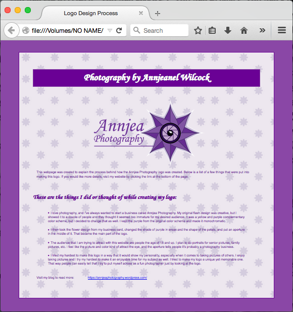
A web page made using HTML coding. The page includes the details of creating the logo shown.

Process:

Using TextWrangler on my Mac, I created the main HTML code and CSS to go along with it. I did a lot of changes on my logo. I changed the shape and shades first, and then I changed the text and glare placement on the second round. I wanted to know how to change the borders and insert a background image, so I used google a lot. There were so many wonderful things I learned with this assignment! There is actually an eyedropper tool available for free in Google Chrome if you don’t have photoshop handy.

Message:

I am trying to put across the message that I am a fun photographer, yet still professional. I know what I’m doing when it comes to taking pictures. I’m not your average photographer!

Audience:

My audience is those who are 18 years of age and up. I can do senior portraits, family or baby pictures, and so many more. I’m trying to draw in those who want a photographer who will make their photo shoot fun and exciting to be at, instead of the normal photographer where you have to fake a smile.

Top thing learned:

Always double check how the CSS and HTML code are agreeing with each other. I made the mistake of renaming the CSS file and not changing the name in the HTML code. The website looks terrible without the CSS! I need to double check everything very often.

Colors scheme and color hex(s):

Monochromatic – Purple – #8a47a6  #6a0195

Title/Copy font families & category listed:

Monotype Corsiva – Script

Veranda – Sans-serif

Changes made to CSS:

I centered my personal logo, changed the colors of the background and words, changed the fonts and font size, made the border double thick, changed many margins/padding, and added a comment.

Word Count:

292

Project 6: Stationary

Letterhead:

P6_AnnieWilcock_LH

Business Card (8.5×11):

P6_AnnieWilcock_BC

Business Card (Large):

P6_AnnieWilcock_BCLarge

Description:

A business card and letterhead designed for a company called Annjea Photography.

Process:

Starting out, I had no idea what I wanted to do. I decided to switch companies for this assignment compared to last and create a logo for a personal company called Annjea Photography. I created the logo in Illustrator, and at first it was a shape of a flash from a camera. The company name was listed on it and a few swirls connected to the words. The color scheme was complementary using purple and yellow. I put it on both the card and letterhead created in Indesign, and because the logo was so busy alone, I only added the information needed and a few colored rectangles behind.

After my two critiques, I yet again decided to completely change the design. I took the flower on the business card from the original design and decided to put an aperture in the middle and make that the logo. After I decided on that, I sketched out completely new ideas. After that, It was fairly easy to put create those designs on the computer.

Message:

There is a sweet, professional photographer in the area in case you would like to use her services. Here is her name, number, email, and address to contact her easily.

Audience:

People ages 16 and up who would like portraits take. Single, couples, and families all welcomed for the services.

Top thing learned:

It is important to remember the audience. My original design would have been for a younger age group and didn’t seem as professional.

Color scheme/name:

Monochromatic – Purple.

Title/Copy font & category listed:

Monotype Corsiva – Script.

Project 5: Logos

P5_AnnieWilcock2

Description:

Logos I made for a made-up dance company.

Well-written process:

Some people come up with the logo designs first and then a company that they could be for. However, I was looking for a clever name for a company and then designed the logos for that company. The word “chaîné” is a ballet term, and it looks cool with the accents, so I chose it for a dance company. After that, I sketched out a few ideas. I played on Illustrator with them and came up with a few good logos. I did a couple of critiques, and after the one with Bro. Pingle, I decided to just redo the second logo completely. I googled some logos to come up with inspiration and came up with a more professional 2nd one that actually came out really good. I changed a lot of things with the others (especially the backgrounds and contrasting fonts), and it took me about 3 hours to revise them all. I printed it out and sent a picture message to a bunch of friends for feedback. Surprisingly, the votes are very spread out. (See results below.)

Message:

The emotion these logos are supposed to give is that the company very fancy and cute. It is advertising for the dance company. These logos would most likely be put on team shirts and sweaters for decoration too.

Audience listed:

The audience that I am trying to appeal are 10-18 year olds who are interested in ballet, as well as their parents.

Top thing learned:

I do way too much with design. I have to remember KISS with logos (Keep It Simple Stupid). I added backgrounds that ended up being unnecessary and didn’t portray the message. With logos, it is more about quality than quantity.

Colors schemes and color names:

Monocromatic – Pink; Big Split Complementary – Purple, Green, Yellow, Orange; Analogous – Blue, Indigo, Purple.

Title/Copy font & category listed:

Avoye LET – Script; Tamil MN – Sans Sarif; Arial Black – Sans Sarif; PT Serif – Old Style; Corbel – Sans Sarif; Snell Roundhand – Script

12 votes and order

My favorite was the 1st.

1st Logo: 5 most favorite, 4 second favorite, 3 least favorite.

2nd Logo: 5 most favorite, 4 second favorite, 3 least favorite.

3rd Logo: 2 most favorite, 4 second favorite, 6 least favorite.

Project 4: Montage

D&C 1-38-3

Description: An image of different words from God, whether through Him or His prophets and other servants. It is meant to uplift and share the good word of God.

Well-written process: For a spiritual theme, the first thing I thought of was a picture I took a couple years ago of my CTR ring on an open page in the Book of Mormon. I had recently taken a picture of my favorite books by Gordon B. Hinkley and his wife and then decided that I would take a picture of an Ensign article on a laptop to show that the Words of God can come through many people and sources. The scripture D&C 1:38 came to mind that was perfect for the assignment. After creating the rough draft in photoshop, I had two critiques. I decided to change the color of the words to create kind of a monochromatic color scheme from the purple in the flowers on the book. I changed the picture on the article on the computer so a glare wasn’t there, added texture, and added a couple of shapes in the corners for flare.

Message: There are so many sources for words from God. Sometimes they are directly from his books (the scriptures) and sometimes they are from his servants (prophets, apostles, etc). His word will always be fulfilled, and though the earth may be destroyed, His words never will.

Audience listed: The people that this is directed to are those of the LDS community. It is to refine and strengthen their testimony of the word of God.

Top thing learned: I learned that sometimes less is more. I realize now that my design may be a little too busy. It gets the message across great and still looks cool, but there’s way too much to look at. I should remember that from now on.

Filter listed: Gaussian Blur

Colors scheme and color name: Monochromatic; Purple

Title/Copy font & category listed: Bookman Old Style Bold

Thumbnails of images:

WilcockAnnjeanelDSCF1641 IMG_5344 IMG_5899 WaterPlain0010_L

Links to images/Source:

First 3: Personal Photography

Fourth: http://www.cgtextures.com/texview.php?id=19792&PHPSESSID=5mqtqfv94snkltf8v5jpc3c2n2

Project 3 Photodesign

p3AnnieWilcock copy

  1. Description: A monochromatic, photo design with a pleasant quote.
  2. Process (Programs, Tools, Skills, FOCUS principles): First for this class, we had to adventure around and try to find meaningful things to take a picture of for the assignment. Then we had to use the skills we learned about creating a visually appealing photo to make the subject crisp and clear in focus, give the appropriate lighting, and use correct composition. While finding subjects to photograph, we had to keep in mind a quote or short saying that would fit and a specific color scheme. After taking many pictures of the lilies, I chose my favorite and began editing it in photoshop. I added the design shapes and quote, and was going for an analogous color scheme. I had two critiques,one with a classmate and one with my teacher, and then decided to almost completely change the design. I changed the picture, color schemes, design shapes, and almost everything except for the message, theme, and quote.
  3. Message: The picture is supposed to symbolize a meaningful time in life with the wedding ring. The quote adds to that, giving the feeling of, “Relax. Slow down and enjoy the meaningful moments in life.”
  4. Audience: This quote and picture are mostly directed to newly engaged or married couples. This is personally the kind of picture and quote that I would hang on my wall when I got married. It is extremely intriguing to the people who want marriage or have obtained it and see the full worth of it.
  5. Top Thing Learned: I learned that drafts do not always turn out the way you imagined. I also learned that it is possible to draw blanks when assigned a project. What I had in mind didn’t turn out as I would’ve liked, but we make mistakes. We can get over them with advice and help from others and especially through asking God for help.
  6. Color scheme and color names: Scheme: Monochromatic, Color: Green.
  7. Title/Copy Font Name & Category: Marion: Oldstyle
  8. Taken 2/4/15 at the BYU-I Flower Center

IMG_5738

Project 3 Activity: Photography

AnnieWilcock-01-Light-Outside

Light 1: Outside

AnnieWilcock-02-Light-Inside Light 2: Inside

AnnieWilcock-03-Focus-Foreground

Focus 1: Foreground

AnnieWilcock-04-Focus-Background

Focus 2: Background

AnnieWilcock-05-Composition-Thirds

Composition 1: Thirds

AnnieWilcock-06-Composition-LeadRoom

Composition 2: Lead Room

I absolutely loved this activity. Photography is my concentration in college and definitely one of my greatest passions. For the pictures of light that I took, the subjects just touched me. I love sunsets and the beautiful colors that streak across the sky. I especially loved the wispy clouds that happened to be in the sky that day. The Hyacinth flower was a gift from my father for a bit of Spring during the Winter. It sits on a stool on the South side of the house right next to a window, and the lighting was perfect. Depth of field (focus) is possibly one of my favorite aspects of photography. With an SLR camera, you can easily adjust the focus on one object and have the rest of the picture blurry, which I love. I had my friends sit in that order to look like college students working on homework, and I played around with the focus on different people a bit.

Composition is extremely important in a picture. You can have perfect focus, fabulous lighting, and a gorgeous subject, but if the angle and set-up isn’t just right, it throws off the whole picture. In the first photo, the rule of thirds is necessary to make it flow well. The rose and leaf are on the bottom thirds, and the broken twig on top creates a nice top line for the rule of thirds grid. The last picture was actually a snapshot of our lab assistant for my photography class. As we were taking the pictures, I was thinking exactly about the lead room theory. She happened to be facing the perfect direction, and I snapped a picture so that it looks like she is taring through the entire photo. It helped create great flow.

Project 2 Advertisement

Models needed4

Description: The students in the basic photography classes need models. If a person fits the requirements and would like to help, they may contact me and I will assign them to a student to model for.

Process: For this assignment, I used Microsoft Word. First, I sketched out a couple small ideas for layouts for the project, and I ended up using the continuing themes in them. I then created the separate shapes through the documents to show the main layout. I added the Word Art title, body copy, and then the images. I then did two critiques and got a lot of input to change my draft. I changed the color scheme to add a greater affect for the audience, I changed the body font to make it easier to read, etc. After that, I made changes here and there all the way until I printed it out. I had problems with printing it, but it eventually worked. I am turning it in after I printed it this time, because I made sure I made time to go into town and do so.

Message: Hello attractive BYU-Idaho college students! Do you like to dress up fancy and have your picture taken? Are you available on Wednesdays and Fridays after 5:30? Well, the Art 160 class needs models. Contact me and/or come to the meeting!

Audience: This is specifically for BYU-Idaho college students. It is colorful enough to attract the younger, bouncier people and to draw any person’s eye, yet it has enough style and professionalism to catch the attention of the older students too.

Top thing learned: I need to concentrate more on the color scheme that would capture the audience most effectively. The monochromatic scheme was not a good choice for my audience, because it is too calm. The orange makes it a bit brighter, friendlier, and more intriguing.

Colors scheme and color names: Scheme is complementary. Blue and orange.

Title/Copy font & category listed: Cambria (Word Art) – Slab Serif; Franklin Gothic Medium – Sans Serif

Source of scanned image: Personal photography (Scanned this for , but ended up using other pictures, also personal photography.)

A4AnnieWilcock

Project 1 Flier

P1GraduateFlyer2

  1. Description: Flier for Graduate Leadership Conference.
  2. Process (Programs, Tools, Skills): To create this flier, first I had to create sketches to come up with ideas for the flier design. After I drew four sketches, I asked a few people which they liked best for the chosen audience. I chose one after receiving that feedback, and that’s when I got on InDesign to create the layout. I know how to use Photoshop really well, and InDesign is similar, but I still needed some help with it. I use the computers on campus, and so I was able to easily get help when I had a question. Google of course was wonderful too. After I created my draft, I had three people critique it: my teacher, someone who had previously taken the class, and a current classmate. They all gave me suggestion, and I then went back on to InDesign to polish up my design.
  3. Message: The message on this flier is that there is a wonderful opportunity for graduates to get the upper hand in the business world by attending and learning at a leadership conference.
  4. Audience: The audience I am targeting is not businessmen or undergraduates. This flier is for the recent and upcoming graduates who could use some help getting a head start in the world after college.
  5. Top Thing Learned: I learned in this first project that I naturally lean more towards the creative part of the design and not as much the message. I have lots of room for improvement there.
  6. Title Font Name & Category: Consolas/Sans Serif
  7. Copy Font Name & Category: Marion/Oldstyle
  8. Links to images used in this project:
    https://130.commbyui.org/wp-content/uploads/2013/01/VouantLogo3.png      https://130.commbyui.org/wp-content/uploads/2013/01/JuliePeterson-Leadership-conference-business-rexburg-Idaho_7653-as-Smart-Object-11.jpg